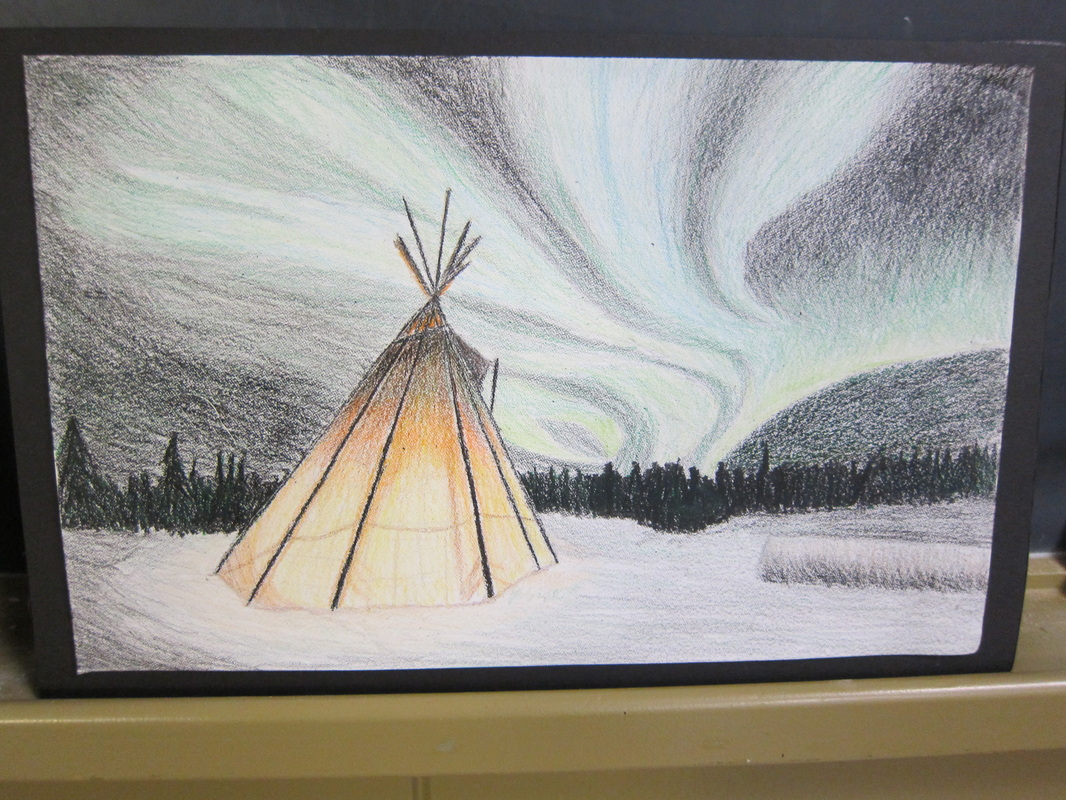
As my final art project this year, I created a drawing of the northern lights, using crayola crayons. I'm very proud of this piece, due to the fact that I used such an unusual medium. Crayons are usually regarded as a small child's art tool, used to create nothing more sophisticated than simple doodles and stick figures. I've worked with crayons before, using the encaustic technique, which involves melting them over a paper placed on a hot surface, but this is the first time I've ever used plain crayons without any other techniques. This is probably one of the fastest art projects; I completed the entire thing in under a week. I started by finding the image I wanted to base my drawing off of, which is available at this page. The picture has a nice blend of colours, which made my drawing have good visual appeal when it was created. After I'd found a picture, I did a quick sketch of where I wanted the general elements to be. I sketched in the tent from the picture, and placed the lines of the boundaries of the northern lights. After sketching in the lines in pencils, I started actually colouring the project. While colouring, I had a piece of looseleaf beside me, which I used a lot for testing how different colours of crayon blended together. I also had a pencil sharpener, which I used to keep the crayons sharp, so that I could keep my lines and shading clean and even. The tent took me one art class to complete, and the northern lights two. I really enjoyed the challenge of blending the colours together realistically. Ordinarily, colour blending isn't one of my stronger areas. I prefer pencil drawings over pencil crayons or markers, because I feel I'm generally more capable with greyscale drawings. However, I very much like the way my crayon drawing turned out. This piece was used as a crossover for my final project for geography. We had to create a drawing of a Canadian landform. Even though northern lights aren't technically a landform, I think that the landscape is very much Canadian. I wanted to have my drawing be something unique, knowing that everyone in the class would be drawing mountains and rivers with common mediums such as pencils, pencil crayons, or paints. I'm definitely the only one to have chosen crayons, and my drawing has generated a lot of positive response. I think that this piece of art is inspired by two sources. One is the encaustic style that I mentioned earlier. I've done encaustic work a handful of times before, and I love the way that you can make the colours as vivid or subtle as you like, simply by adding grey crayon or not, and blend so naturally. Encaustic is probably one of my favourite styles, because it's so unique and not widely used. The second source I believe I took inspiration from is Jeffrey Robert, an artist who focuses exclusively on crayons. His drawings are viewable here
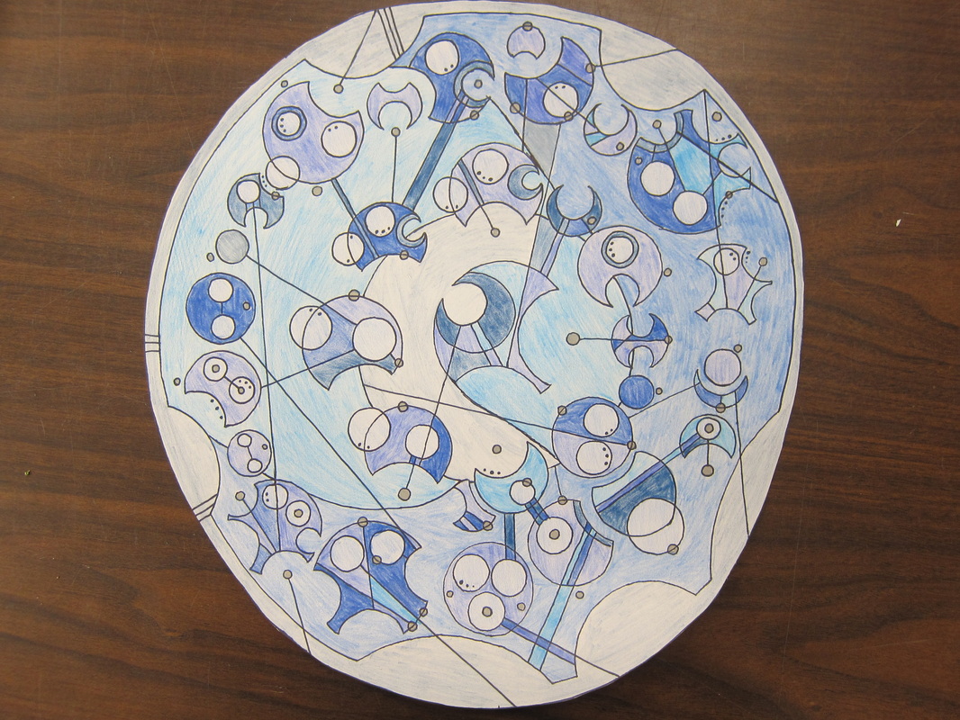
This project was definitely a challenge for me. Circular Gallifreyan isn't an easy way to write, and large pieces such as this take ridiculous amounts of planning. Admittedly, I got a bit sick of working on this towards the end, and the colouring isn't great. Then again, I'm no master with pencil crayons as it is. Circular Gallifreyan is, as described on the television show Doctor Who, the language of the Timelords. In the show, there are multiple places where the language can be seen, most often on the TARDIS's display monitor, and most famously in the complex design found on the Doctor's pocket-watch. However, the symbols used in the show are complex, and don't translate well. It appears to be that there is a different symbol for each word. While this would make sense for Timelords, who live far longer than humans and therefore have much more time to learn the language, it doesn't work as well for the average human. Thankfully, some awesome fan by the name of Loren Sherman, who I believe is only slightly older than myself, created a much easier language that looks remarkably similar to BBC's Circular Gallifreyan. He's also created a very thorough PDF instructable, available here: http://www.shermansplanet.com/gallifreyan For my project, I also took inspiration from a drawing Loren Sherman created in photoshop, featuring a poem from the Doctor Who series. His creation, viewable here: http://blackhatguy.deviantart.com/gallery/24226709#/d4f4a4c, is much more impressive than my final piece, and the layout was less traditional. My Gallifreyan artwork features a lengthy, but very famous, line from Doctor Who. “People assume that time is a strict progression of cause to effect – but actually, from a non-linear, non-subjective, viewpoint, it's actually more like a big ball of wibbly wobbly, timey wimey...stuff.” To create this project, I first had to write out every word onto a separate circle of paper. When writing Gallifreyan, each word consists of a circle. The circle will have more circles, domes, lines, and dots, each specifying different characters. Each word-circle is arranged into a much larger circle to create a sentence. When a sentence is long, as mine is, words are read counterclockwise, from the bottom of the outward-most circle, proceeding inward in consecutive circles as you go around. It's a very unique form of writing. To make sure all my words would fit, I had to cut each one out separately, arrange them on a paper, and then trace the final arrangement onto a much larger piece of paper. After my design was traced, I 'spellchecked' it, making sure that no overlapping lines didn't change the meaning of my work. I then traced it with a sharpie marker. After that, I coloured it with a variety of shades of blue. Blue was chosen because, well, it's Gallifreyan, and the TARDIS is blue. Colouring this design was possibly the most annoying and frustrating part, and I admittedly slacked off a bit. The end result isn't near as neat as I would have liked it to be. Overall, I feel that while I did put a lot of time and effort into this work, I got tired with it after a while, and as a result, the artistic ability is no longer quite there.
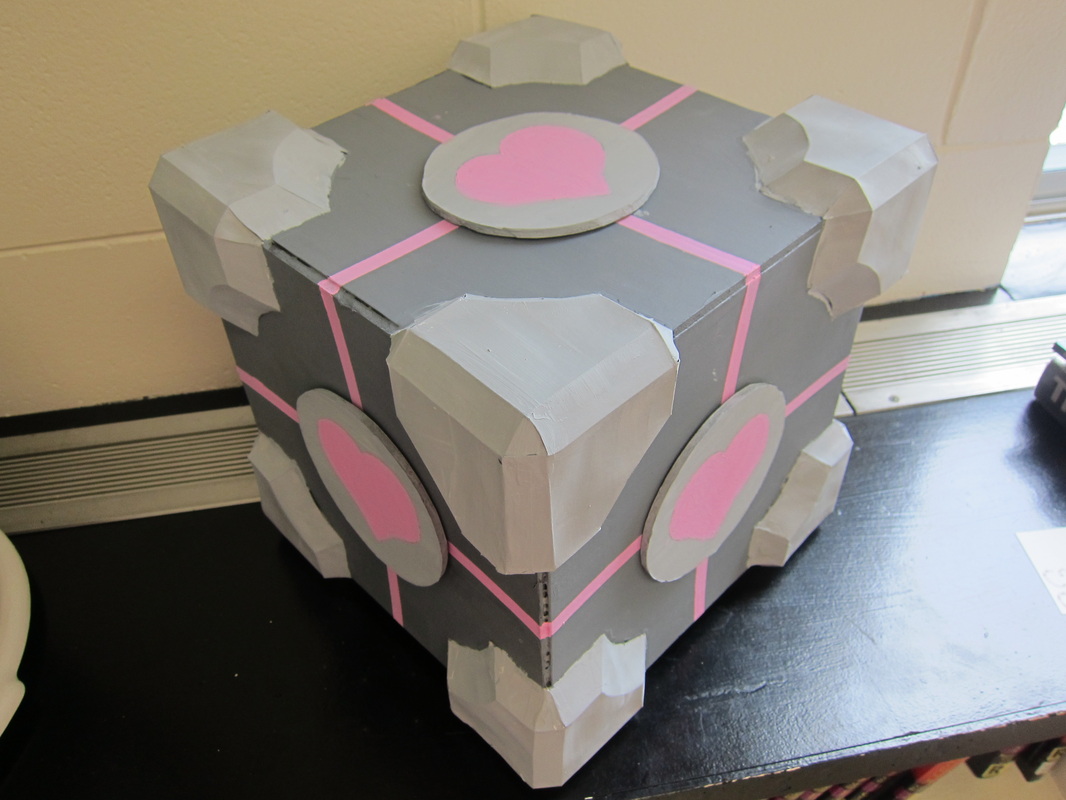
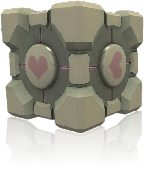
" The Enrichment Center reminds you that the Weighted Companion Cube will never threaten to stab you and, in fact, cannot speak. In the event that the Weighted Companion Cube does speak, the Enrichment Center urges you to disregard its advice." - GLaDOS For my third art project of the year, I made a replica of the Weighted Companion Cube from the video-game Portal. I'm a huge fan of the games, and, like all Portal fans, I especially loved the Companion Cube. For anyone who hasn't played Portal, the game revolves around an artificial intelligence program called GLaDOS making the player, represented by a character named Chell, solve tests. These tests often involve lasers, potentially lethal falls, or GLaDOS's favourite, neurotoxin. Chell is equipped with a gun that shoots both an orange and a blue portal. When both portals are active, you can enter one and come out the other. In one level of the game, GLaDOS gives Chell a Weighted Companion Cube, which she has to take with her through the entire level. At the end of that test chamber, the player is forced to throw their Companion Cube into an incinerator, destroying it. I based my version of the companion cube off of a tutorial I found here. I started with six 11"x11" squares of foam core, and glued them into the shape of a cube. Originally, I wasn't sure if glue would be strong enough, and tried to attach them by placing paper clips in between the layers of the foam core. However, I realized that lining them up was very difficult when trying this method, and so I switched to using glue. Now that the project is finished, the glue has proven to be more than strong enough. After creating the cube shape, I cut out the eight corner pieces, and folded and glued them together. After I had glued them onto the cube, I found a YouTube video which had suggested to reinforce the corners by putting newspaper between them and the cube. I regretted not finding the video earlier, but by this point it was too late to do anything. While gluing the corners on, I also debated whether or not I was going to add the edge pieces. As you can see in the picture below, the Weighted Companion Cube created by the game designers has raised pieces along the edges which my version lacks. I decided not to add in the edge pieces for a number of reasons. I couldn't find any very good online templates, and it would have been very time-consuming. Because there was a deadline for this project, I didn't want to waste time cutting out, folding, assembling, and gluing on twelve edge pieces.
When I'd attached the corners, I started painting the cube. The only real problem I ran into while painting was getting the colour right. The grey from the bottle had a slight greenish tinge to it, which I didn't want to use for my companion cube. I mixed my own grey out of black and white paint, which worked fine.
The Companion Cube used in Portal is designed to replicate a human's weight. Obviously, my hollow and miniaturized version is mostly air. The entire thing probably weighs only a pound or two at most. Therefore, I say that my creation is an UNWeighted Companion Cube.
Overall, I'm extremely happy with my Companion Cube. There are versions of the Companion Cube all over the internet, ranging from replicas like mine to plush version to fuzzy dice. I'm definitely looking forward to creating more Portal-based artwork. Maybe I'll crochet a Companion Cube next...
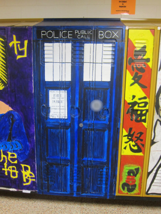
For my most recent art project, I painted my locker, and two of Shannon's, to look like the TARDIS. The TARDIS is the time machine and spaceship from the television series Doctor Who, which I'm a tiny bit obsessed with.
I ran into several problems while creating this project, but, despite this, the finished product made me very happy. Originally, I had wanted to start my locker about three weeks sooner than I actually got to. I had to delay, due to a lack of blue paint in the school. Seeing as almost the entire TARDIS is some shade of blue, it wouldn't really work to paint it without blue paint.
A second problem I encountered was painting edges. I have shaky hands, so keeping lines straight and clean can be difficult and very time-consuming for me. I managed to overcome this problem by taping the borders where colours met. However, this lead to a new problem. If the tape stayed on the locker for extended periods of time, the paint underneath would peel away with it. Again, I managed to overcome this problem. I learned that if I kept the tape on my locker for two days at maximum, the paint wouldn't peel away when I removed it.
Another problem, though very minor, was trying to decide how many lockers my design would take up. Three lockers was slightly too wide for a proper scale, but two lockers was much too narrow. I ended up adapting the design a tiny bit in order to make it fit across three lockers.
The process of painting the locker was a bit lengthy. I first had to prime the locker, which left it in a nasty-looking shade of grey. It stayed this colour for much longer than I would have liked, due to the no-blue-paint issue. After I got the locker primed, I went on to sketch out the design. This involved a lot of measuring, in order to get proportions as close as possible, and to get the design to be symmetrical. When the design was sketched out, painting could commence. I taped the borders, so that the paint would only go where I wanted it. Each part of the locker required multiple layers of paint. Anywhere that was white took two layers. Blue areas took three; a light layer, a medium-toned layer, and a dark layer on top. Because I painted the layers on with a sponge, you could see some of the lighter layers through the darker surface layers. This was done in order to recreate the 'wooden' texture of the TARDIS.
Overall, I'm insanely happy with my locker. It's incredibly satisfying to be able to go to it every day and feel a bit of pride at what I accomplished. Not too many people in the world can say that they have their own TARDIS.
No Copyright infringement intended.
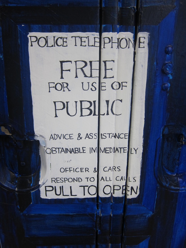 Here's a close-up of the sign on the front door.
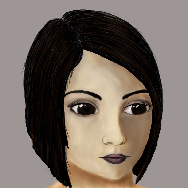
For my first art project, I decided to work on a computer program called Gimp. Gimp is a digital drawing and photo manipulation program. Using my drawing tablet, I painted a picture of a person's face in my Gimp program.
The final image is based off of an original character I created for use in stories. The character's name is Oraicia Cooper, and I've used her in many short stories and online Role-Playing communities. I figured it was about time I drew a picture of her. This project was fairly challenging for me. I haven't had a lot of practice with Gimp, and drawing faces is definitely not one of my artistic strengths.
To create this painting, I first did a rough copy in my sketchbook. When I was satisfied with the rough copy, I tore out the page and taped it onto my tablet. This allowed me to trace the lines from the paper into Gimp, so that I had a rough idea of the shape of the face. After that, I followed a tutorial I found on gimptalk.com, which explained how to paint a portrait in Gimp. One of the biggest challenges was applying the tutorial's instructions to my own drawing. The tutorial gave details for a face-on view, and my drawing is a 3/4 view.
Overall, I'm very surprised with how well the drawing turned out, especially compared to some of my previous attempts at portraits. If I had to pick something from my drawing I think I could have put more effort into, it would be either the nose or the hair. The hair was a little bit rushed, and didn't turn out quite proper. It's slightly darker than I wanted, and there isn't any distinct light and shadows. The shading on the nose is also a little bit off. Some parts have very little shadow, which makes it look a little bit strange. I was very pleased with how the eyes turned out, considering I've never really practiced drawing eyes before.
If I'd had more time to work on this picture, I may have attempted a background. A dark forest would have looked nice in this image.
|
 RSS Feed